AI Content Generation: 30 Days in 1 Hour
Social media succeeds through consistency, but many excavators avoid it because daily posting feels like another full-time job. They are busy operating equipment, managing crews,

Most excavation companies understand where their leads originate. However, few know which leads actually generate revenue. When a call is received, a job is scheduled,
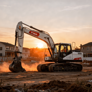
Mobilization fees often cause confusion in excavation pricing. Customers notice an unexpected line item and may assume it’s additional profit, creating tension before work begins.
Every contractor encounters it. “I received a lower quote.” For many, that statement ends the discussion. They either lower their price, defend their value, or
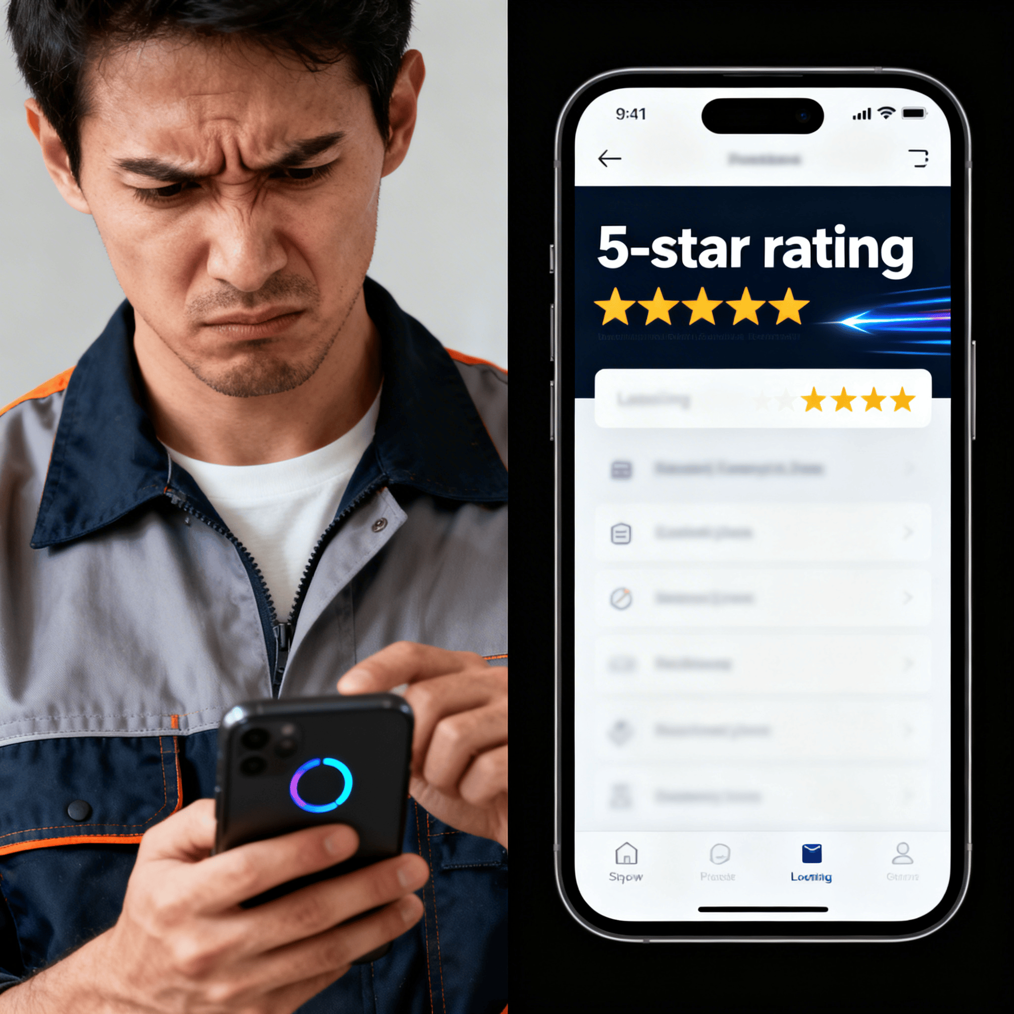
Many excavation jobs are lost before price is even considered. The issue isn’t always the quote itself, but how it’s presented. A brief text message
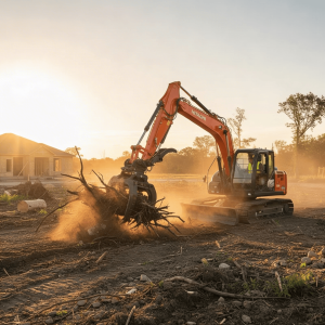
Root raking is frequently misunderstood. Many landowners view it as extra effort, consider it optional, or confuse it with basic debris removal. This misunderstanding makes
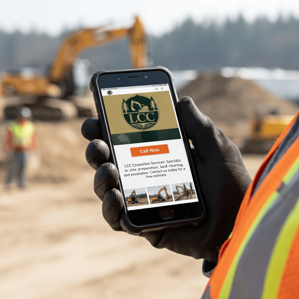
Most contractors view Facebook as just a billboard, posting ads with a phone number and hoping for calls. However, this approach seldom succeeds in local
TikTok isn’t just about trends and dances. It’s also a powerful platform for showcasing real work, especially heavy equipment. Excavators, for example, shift dirt quickly,
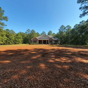
Your work may be clean, but your photos often aren’t. Dust, shadows, cluttered backgrounds, overcast skies, and inconsistent lighting can spoil an otherwise excellent “after”
Social media succeeds through consistency, but many excavators avoid it because daily posting feels like another full-time job. They are busy operating equipment, managing crews,
